
Helping users organize, shop, and preserve food while providing a budgetary and environmentally conscious mindset


Brief Summary
Blue Jay is a mobile application that helps people plan, organize, and manage the groceries they’ve bought into their kitchen with ease. It encompasses an all-in-one grocery to kitchen approach for organizing, shopping, and preserving food, all with a budgetary and environmentally conscious mindset.
Blue Jay offers accurate food prices based on specific grocery store selections, a complex grocery search engine, and detailed budgetary visualizations. With this in mind, we are here to fill the gap for an all-in-one approach, to eliminate confusion and create simplicity for all.
My Role
Sole UX Designer - leading the application from conception to delivery
Responsibilties
Conducting interviews, paper and digital wireframing, low and high fidelity prototyping, conducting usability studies, design iterations, information architecture, accessibility considerations, and a mobile specific application.
Project Duration
September - November 2021
Client
Passion Project
Problem Statement
The problem is that many users struggle to tackle one or all steps involved with a typical grocery experience. This included preparing and planning the shopping lists, buying unnecessary items, and improperly maintaining groceries. These actions created more problems which resulted in increased budgetary spending, decreased productivity, and food wasting.
Goal
The goal was to find a solution for an all-in-one approach to simplify the planning, organizing, and food inventory experience, all while having a budgetary and environmentally conscious mindset.

Primary Interview Research
I interviewed a total of 5 participants who had access to a kitchen and shopped at the grocery store at least once per month. Questions were open-ended and included various questions about planning, shopping, spending, and maintaining items in their kitchen.
It was quite interesting that there were many different approaches to the entire process. Some said they had shopping lists (on paper or digital), while others just went to the store when they needed specific items. From a psychological perspective, some participants enjoyed the shopping experience because it felt therapeutic, while others displayed a high level of stress with a “get in and get out” mindset. Participant focus on spending habits were vastly different as well. Some decided that going with the cheapest product or using digital coupons was their strategy, while others focused on name brands and quality.
From a similarity perspective, I noticed was that each participant had rough idea of a projected spending limit, but the end results of how much they spent were vastly different. Many times users were not good at anticipating what prices of items were going to be, which in turn affected their total spending. From a food organizational standpoint, no users had a specific strategy on how to preserve foods which resulted in food waste. Each participant said that they threw out around 20% of the total items they purchased from the last shopping trip. A majority of the time, it was because of forgetfulness. It was apparent that initial research assumptions were much different than I had projected.
Participants
5 users
Requirements
Age 18-50 years old
Shops at least 1x monthly
Mobile device access
Refrigerator & freezer access
Conditions
Moderated & Recorded Phone Calls

Interview Findings
Based on interviews, I found five interesting challenges and struggles individuals faced with the grocery shopping experience.
1
Emotional Barriers
Many users have felt overwhelmed, stressed and disconnected with the entire food management experience
2
High Spending
Many users are simply frustrated with higher grocery bills. Expectations about what users want to spend versus what they actually spend are much different.
3
Lack of Planning
Many users lack a streamlined or organized approach from start to finish with the grocery experience. Many users are constantly changing their game plans for each trip.
4
Forgetfulness
Many users completely forget about purchasing certain foods because of lack of meal planning or disorganization in the freezer or fridge.
5
Food Wasting
When discussing the previous issues of forgetfulness, users are ultimately throwing away expired and spoiled foods. This leads to feelings of frustration, sadness, and anger.

Empathy Maps
After discovering these important and wide range of findings, I had to create four empathy maps to convey various grocery experience habits. I wanted to create a shared understanding of the users needs and aid in the decision making process. I present to you, Jasmine, Warren, Jillian, and Matthew.


User Personas
After discovering important findings from primary user interviews, secondary research and empathy mapping, I created four personas that encompassed unique situational personalities with the grocery shopping experience.
(Blue%20Jay).png)
"
The forgetter
"
"
The non-organizer
"
(Blue%20Jay).png)
(Blue%20Jay).png)
"
The non-planner
"
"
The money spender
"
(Blue%20Jay).png)
User Journey Maps
After creating personas, I wanted to take two of the personas, Matthew and Jillian, though a scenario involving their direct actions and emotional feelings. The journey would take them through their pre-shop, during-shop and post-shop planning. These scenarios also provided an insight of user experience improvement during this process.
(Blue%20Jay).png)
Scenario
Matthew wants to reduce the amount of shopping trips, improve food list organizational skils and focus on expiration dates.
Scenario
Jillian wants to be more mindful of reducing her spending and check expirations more often.
(Blue%20Jay).png)
Story Boards
I wanted to take that step further and examine a close-up and big picture experience of what one of the personas might go through. It was important to imbue this character with true emotions and create empathy from a digital and environmental perspective. This could further my thought process and in turn discover additional features for the application. For this instance we chose Jillian.
Close Up View
(Blue%20Jay).png)
Big Picture View
(Blue%20Jay).png)
Competitive Analysis
Digging deeper into the competitors market created an opportunity to discover strengths, weaknesses, missing features, and opportunities. An excel sheet was created to get a birds eye perspective.
I decided to analyze four companies that met requirements from a direct and indirect competitors standpoint. These were Pantry Check, Foodshiner, Fridg, and Basket.
.png)
Link to Competitive Analysis & Competitive Audit

Pantry Check
Strengths:
-
Detail customization
-
Straight to the point
-
Fantastic Food Search Database w/ pictures
-
Barcode Scanner (slide to scan interaction is cool!)
-
Clean Interface
-
Good Subscription approach (based off number of inventory items)
-
Ability to put % amount of food used
Weaknesses:
-
Poor and outdated application
-
Limited accessibility
-
Inaccurate location of store when creating shopping list
-
Cumbersome options set-up for creating shopping list
-
Lacks brand identity (none from website to mobile app)
-
Very blocky, no color or excitement to engage the user
-
Timeline navigation tab seems worthless

Foodshiner
Strengths:
-
Clean interface
-
Consumed/Thrown % appealing
-
Most icons recognizable
-
Excellent iCloud integration
-
Robust settings options
-
Excellent options for creating new lists
Weaknesses:
-
Poor Search Database
-
Call to Action buttons confusion (Too many navigation options)
-
No pictures used
-
Barcode scanner inconsistent with finding the right products
-
Limited accessibility
-
Limited excitement to engage the user
-
No Splash Screen
-
No Store Location option when making shopping list

Fridg
Strengths:
-
Colorful and Playful approach for the users
-
Quality Brand Identity between the website and mobile version
-
Ability to speak to the user with motivational features like STREAK
-
Hands-off approach
-
Icons and Text easily recognizable
-
Great subscription approach (Fridg Plus)
Weaknesses:
-
Limited accessibility options
-
No pictures of food items
-
Swipe action buttons are confusing
-
Navigation bar needs to be re-worked
-
After adding items to list, unclear what action to take next (Call To Action Weak)
-
Limited Accessibility (Only barcode scanner + Flash)
-
No Food Search Database
-
No Splash Screen
-
No Store Location option when making shopping list

Basket
Strengths:
-
Excellent and easily recognizable pictures
-
Clean Interface
-
Great community based support
-
Excellent Food Search Engine
-
Includes My Favorite store and Dietary Preferences
-
Upload Receipt Option
-
Share Shopping Lists
-
Initiative swipe right/left options (Got it, Remove Items, Add/Remove Item quantity)
Weaknesses:
-
Very limited options for My Pantry section
-
No Expiration features
-
Limited Accessibility options (No Voice over)
-
Requires Sign-Up to use application
-
After completing shopping, items do not go into My Pantry section.
-
Must take photo of receipt
-
Saw limited value in Sales & Coupon tab
-
No search option in Sales & Coupon tab
This competitive analysis research revealed many gaps and opportunities for Blue Jay.
Gaps:
-
Limited Accessibility Options for all applications
-
User Flow and Call to Action buttons are poorly designed
-
Lack of Questions getting to know the user
-
No budgeting navigation tab or focus
-
Limited or no motivational components when completing tasks
-
Features are hidden to customize expiratory notifications

Opportunities:
-
Voice Assistant Technology for various tasks including creating shopping lists
-
Implement Questions including Dietary restrictions, Favorite places to shop, Age, etc.
-
Implement some Budgeting/Financial tab
-
Improved Photos of items and Understanding of icons
-
Create a brand identity across both mobile and web platforms
-
Create an awesome splash screen!
-
Create a user flow that goes from shopping list, to inventory, and expiratory items and finally budget overviews and details, all while giving the user the ability to select certain features.
-
Incorporate motivational saying or quotes when completing tasks.
-
Improved food database searches with clear pictures
User flow and Red Routes
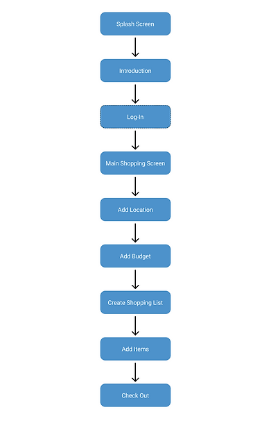
After competitive analysis was complete, I started to think of a complete user flow and task scenario each user would go through with their grocery shopping experience. Each of these user flows were then converted from my previously created paper sketches to digital ones using ProCreate on iPad. When digitizing, I thought this would be the most efficient user experience for the users.
TASK 1: Create, Add Item, and Check Out Shopping List
.png)
.png)
TASK 2: Add Shopping List to Kitchen
.png)
.png)
TASK 3: Check Expiratory Notifications
.png)
.png)
TASK 4: View Budget Spending
.png)
.png)
User flow and Red Routes
After competitive analysis was complete, I started to think of a complete user flow and task scenario each user would go through with their grocery shopping experience. Each of these user flows were then converted from my previously created paper sketches to digital ones using ProCreate on iPad. When digitizing, I thought this would be the most efficient user experience for the users.
TASK 1: Create, Add Item, and Check Out Shopping List
TASK 2: Add Shopping List to Kitchen
.png)
TASK 3: Check Expiratory Notifications
.png)
TASK 4: View Budget Spending
.png)
.png)
Usability Low-Fi Testing (Round 1)
Once red routes and digital sketches were complete, the pages were thoughtfully connected. I interviewed 5 participants to perform a series of tasks. These tasks were followed by specific questions about those tasks. After participants completed the testing, a system usability study (SUS) questionnaire was provided and filled out.
What we are trying to uncover...
Based on our initial fundamental research goals, we are trying to figure out if users can complete core tasks in the application, which include creating shopping lists/budgets, view/add items or lists to the kitchen (inventory), change notifications within the expiratory tab and view a variety of budget options. We want to see if these actions save users money, time, and reduce food waste.
Our research could change minimally or drastically depending on how the users respond to completing the task, respond to follow-up questions, and Key Performance Indicator (KPI’s) data that will be performed.
The following tasks were asked of each participant:
1
Create, add item, and check out shopping list
2
Add shopping list to kitchen
3
Check expiratory notifications
4
View weekly budget spending
Participants
5 users (Mobile App Testing Only)
Requirements
Age 21-50 years old
Monthly Grocery Shoppers
Access to fridge/refrigerator
Access to mobile device
Methodology
Moderated Video Calls
Communication: Skype,
screen recorded
Application: Figma
Time: 45 minutes
Location: Remote, U.S.
KPI's
SUS Questionnaire
Conversion Rate
Clickable Error Rate

Affinity Mapping Diagram
After usability testing, I gathered valuable feedback about the mobile application and clustered those ideas into ten themes. Whether positive or negative, this gave me the opportunity to discover key findings.
_edited_j.jpg)
Usability Study Findings (Round 1)
After affinity mapping, I discovered 5 key findings and some key performance indicators (KPI's). These key iterations were addressed and edited before moving on to the high fidelity versions of the product.
1
Call-to-Action Buttons
Users want to completely change the button flow process when creating a shopping list. Ultimately. this was biggest user experience issue.
2
Introductory pages
Users were confused about what the main home screen represents even after explaining what the application is indeed to do for users. They felt that they wanted a quick tutorial before getting to this point.
3
Terminology
Users were confused with at least one word and what it represented in relation to the application. They would have liked for those words to be renamed.
4
Typography/Icons
Users had a hard time seeing many of the words, indicating that text sizes were too small. They were also confused about what some of the icons represent including one on the navigation bar.
5
Page Layouts
Under the spending tab, users felt that the 'daily' spending tab was unnecessary and wanted it to be removed. They also felt that the 'reminders' section in the notification settings should be consolidated into one area.
Key Performance Indicators (KPI's)
58
System Usability Study Score
All five participants filled out a 10 questionnaire scale on their opinion about the first round of usability testing. Based on the score, my round 2 of usability testing had plenty of room to run for improvement. Based on these scores, my SUS scores barely passed from an acceptability standpoint.
.png)
28%
Clickable Error Rate
An average clickable error rate was calculated for all users by tracking their click path. Results were considered very high and seemed to have a high correlation to task 1. Brainstorming solutions to this problem could potentially be to fix the call-to-action buttons on the home page.

Area of the home screen application with the highest clickable error rate.
60%
Conversion Rate
Because the click-ability error rates were so high, it affected the conversion rate to complete all the tasks. Only 3 out of the 5 users were able to finish all the tasks. The drop-off location seemed to be consistent during task 1 of creating a shopping list.
Usability Iterations (Round 1)
Below are visual side by side changes that the majority of users felt hindered their user experience for the mobile application after critical round 1 testing. I wanted to continue to keep in mind the continued users' wants and needs.
.png)
1
Complete redesign of the 'create shopping list' button by making it a large button with subtext explaining the call-to-action for the user
2
Restructured search icon to enhance its overall usability and putting it front and center.
3
Lighten text font and added an item total count for each shopping list
.png)
1
Increased icon/text size for location and spending limit to improve constant visibility issues.
2
Added 'Add items' button giving users the a front and center call-to-action button instead of just using the search button.
3
Added a motivational phrase to comfort users that there is no items in the shopping list.
.png)
.png)
1
Updated the notification setting button to allow users to know if setting are on or off.
2
Page restructuring of the reminders 'frequency' and 'begin' pages. By condensing the pages into one option, it reduced confusion and redundancy.
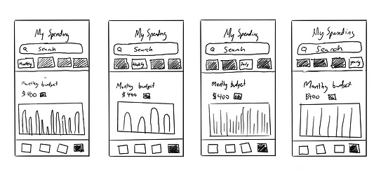
1
Removed the 'Daily' tab as users felt that information tab provided very little relevant data use.
2
Added human emotional language to let users know they are doing a good job on spending
3
Added Y-axis numbers to get a reference to how much they are spending
4
Added a double bar graph for users to visually compare how much they have spent verse what they have left to spend.
.png)
1
Creating an entirely new introduction page process allowed the users to slowly familiarize themselves with the goals of the application and what features are present.
Prototypes (Low-Fidelity)
Below are the low-fidelity prototypes for the mobile application. Each connection between pages were thoughtfully constructed.

Design System
Before transitioning into the high-fidelity prototype, I focused my attention to the design system. This crucial component allowed me to create consistency and cohesiveness between various screen sizes. I focused my attention on a logo, typography, colorography, components, iconography, cards and text fields.
Components
.png)
Usability Hi-Fi Testing (Round 2)
Once edits and design systems were implemented, I took my designs to the next level by creating a hi-fi prototype version. Testing was performed with the same tasks, methodologies, participant requirements and KPI's. Following each tasks, questions were more focused on the user interface.
What was discovered:
After creating another affinity diagram map and compiling user themes, it became apparent that the major user flow errors were fixed. No prioritization 'level 0' changes present this time, only Prioritization 'Level 2.' Two top fixes that users wanted were an improved grocery location search page and an updated spending screen. These additional features were nice to have, but not essential. I also noticed improved KPI's across the board when comparing round one to round two testing.

System Usability Scores
Because of added introductory pages and an improved call-to-action configuration, users had overall improved confidence with the mobile application.
58
84
Round 1
Round 2
Clickable Error Rate
Significantly improving the call-to-action button allowed for a much lower clickable error rate across the board.
28%
5%
Round 1
Round 2
Conversion Rate
Because clickable error rates were drastically improved, conversion rates followed suit.
60%
100%
Round 1
Round 2

Adding this create shopping list button improved usability testing metrics across the board drastically.
Usability Iterations (Round 2)
Below are visual side by side changes that the majority of users felt could enhance their overall user experience for the mobile application after round 2 testing in hi-fi. Although these changes fell under Prioritization Level 2, I still wanted to continue to keep in mind the continued users' wants and needs.
.png)
1
Full screen and enhanced grocery location searching
2
Improved searching capabilities including 'search this area' option to hone in on specific areas of the map that might contain grocery stores
.png)
3
1
Added 'Average weekly spending' feature to let users have increased data to control spending habits
2
Improved color visual double bar graphs to easily recognize the difference
3
Updated 'Shop List' icon, users were confused about first icon and gave them the impression of it being a check-out button as opposed to its initial intentions of just a list.
.png)
1
Full screen page for adding a spending budget
2
Improved terminology to let users put things into context about what the spending budget means.
Accessibility Considerations
1
Barcode Scanner
Providing a scanner allows the user to simply just scan food items as opposed to manually typing each one in.

3
Gestalt Principles
Across the board, the application features key principles including proximity, similarity, continuity, closure, and connectedness.


5
Color Accessibility Standards
2
Visual Enhancements
Users can view high quality food images and clear color coding for expiring foods.

4
Call-to-Action buttons
Users have large call-to-action buttons that change colors once clicked. This lets the users know their actions has been received.


When designing, I knew my color palates had to pass WCAG 2 Color and Contrast Requirements. This insured full and clear visibility for all users
Mobile High Fidelity Prototypes


Final Prototype (High Fidelity)
Below are the final high-fidelity prototype screenshots and links for the mobile application.

Final Takeaways
Impact:
Blue Jay really puts the user front and center. It allows the individual to fully experience the management of their food in an all-in-one application. Through research discovery, my initial problem statement of why individuals throw food away ultimately uncovered more problems that needed to be turned into solutions. I believe that Blue Jay has been able to capitalize on an umbrella of issues.
What I learned:
I learned that product development never ends. The cycle of user experience design is always evolving and continued usability testing is necessary to product a quality product. I also learned that what we ‘think’ a user needs is usually not the truth. The truth is that we discover solutions through our users.

What I plan on doing next:
1
Usability Testing
I will continue to perform usability testing to gain valued insights and ultimately improve the user experience
2
Competitive Analysis
I would like to perform another round of competitive analysis. Because this is becoming a very crowded field, I think it's vital to stay up to date with new features and enhancements.
3
Multi-platform OS
I would like to work on providing multi-platform operating systems including Android as well as expanding responsive device platforms.
4
Analytical Research
I would conduct further research by compiling data to see how many users continue to use the app and new active users. I would take this further by looking see metrics on if users are saving time grocery shopping, spending, and more!
5
Features
Based on usability feedback, I would like to add additional features to the application including cloud share features with family members.
Check out my other projects


